Giga Bites
Extra Large, Extra Tasty
BACKGROUND
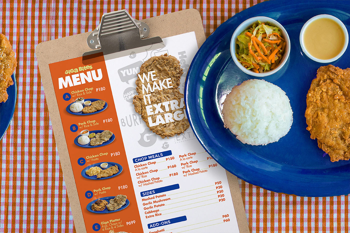
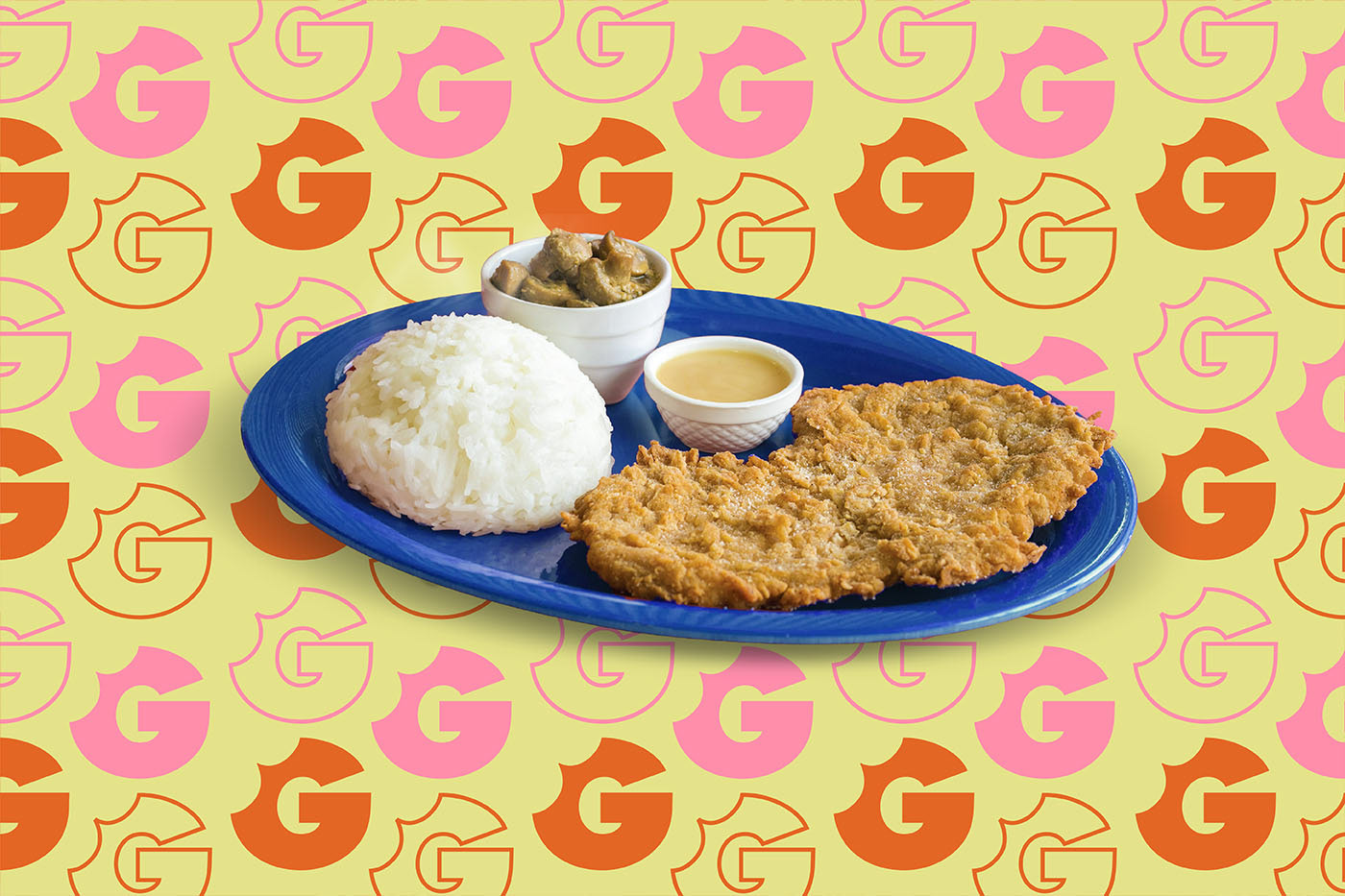
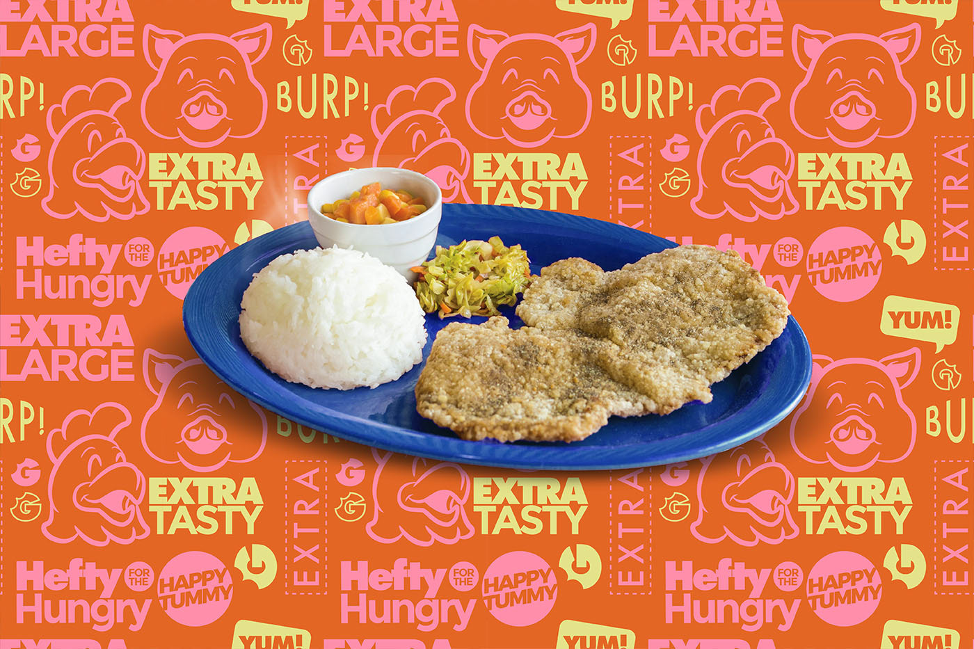
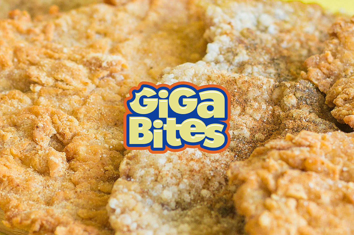
Giga Bites is a small food cart brand from Manila that serves extra large fried chops with sides that can be mixed and matched for a fully-loaded and satisfying dining experience. Customers can choose from pork or chicken, western or oriental, rice or pasta, and more!
THE CHALLENGE
How else can you design a visual identity that stands out and shouts “BIG!”?
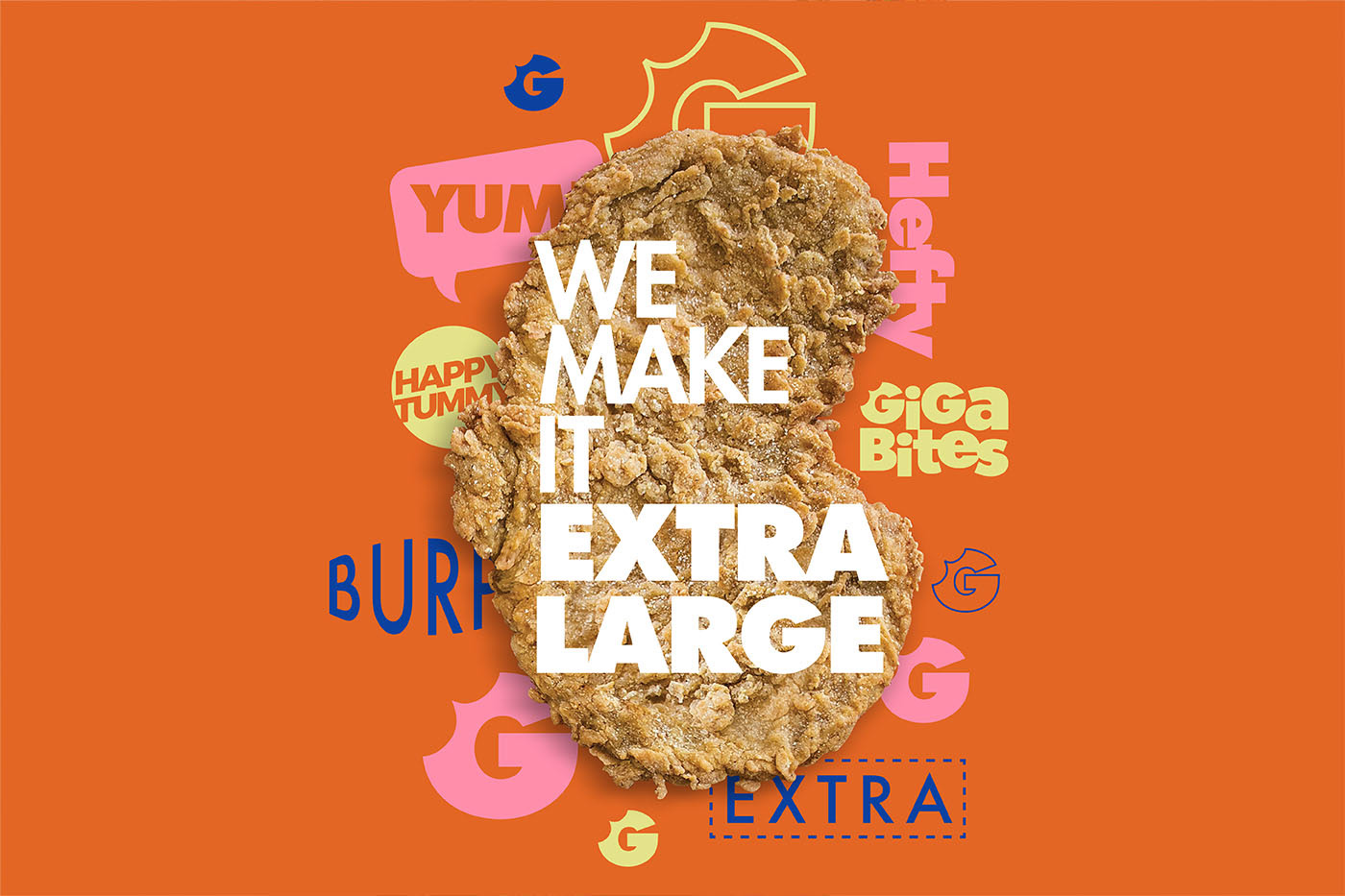
Thick and hefty typography
To communicate how filling and large Giga Bites’ dishes are, using a clean, heavy, and modern sans serif font is the way to go.
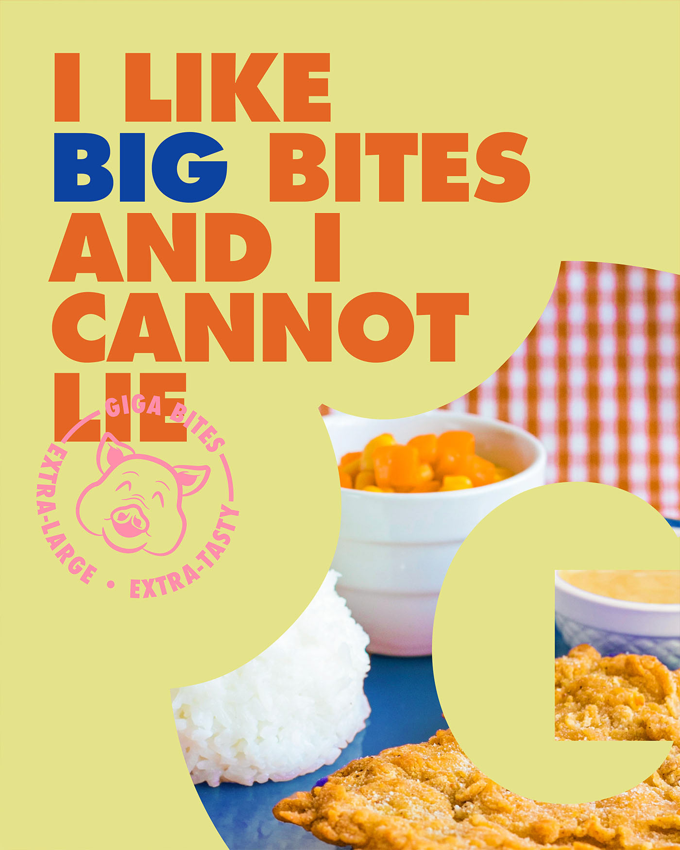
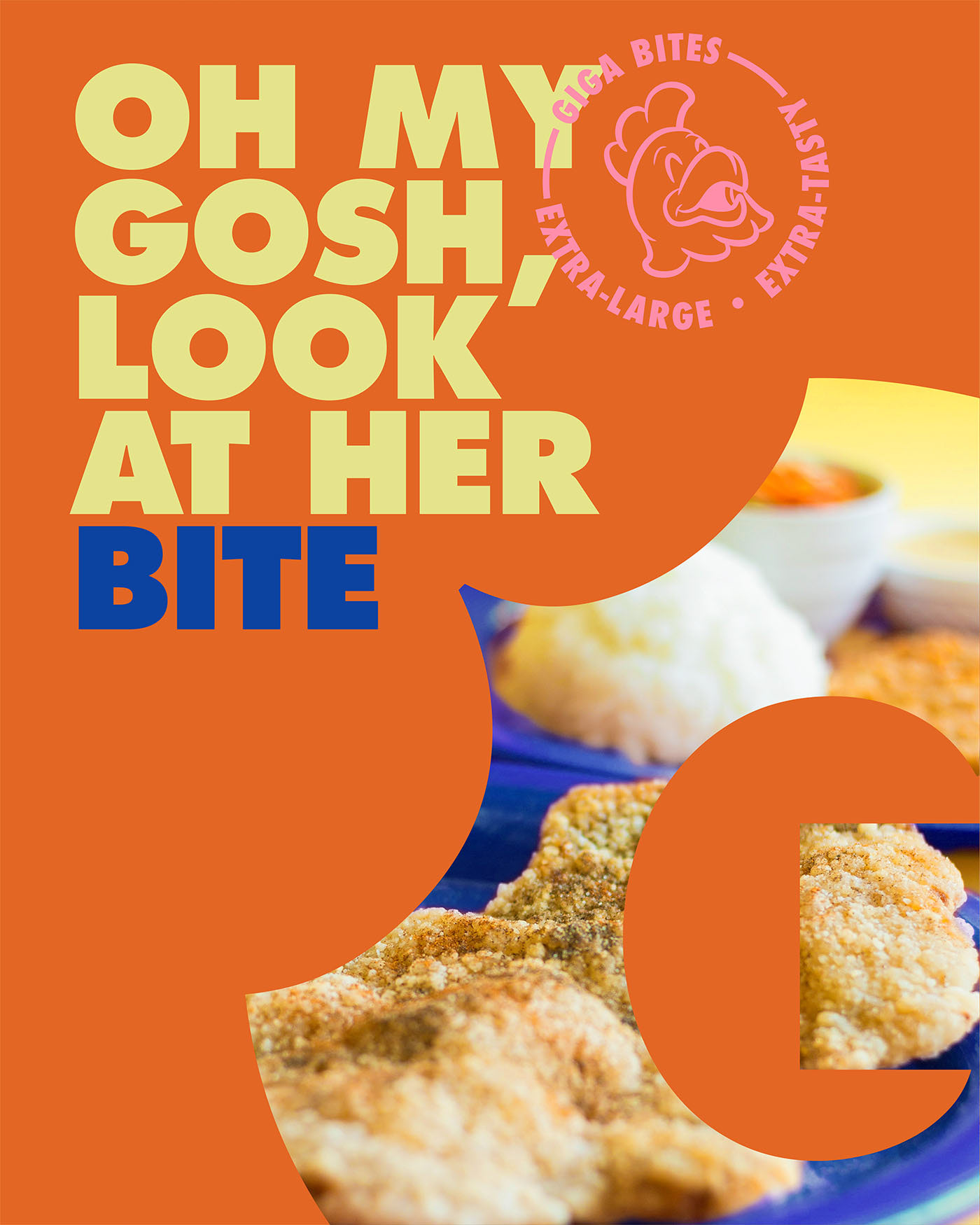
Cheeky, intentional puns
Fun and comic copies are used in the interior posters for a more audacious and memorable identity.
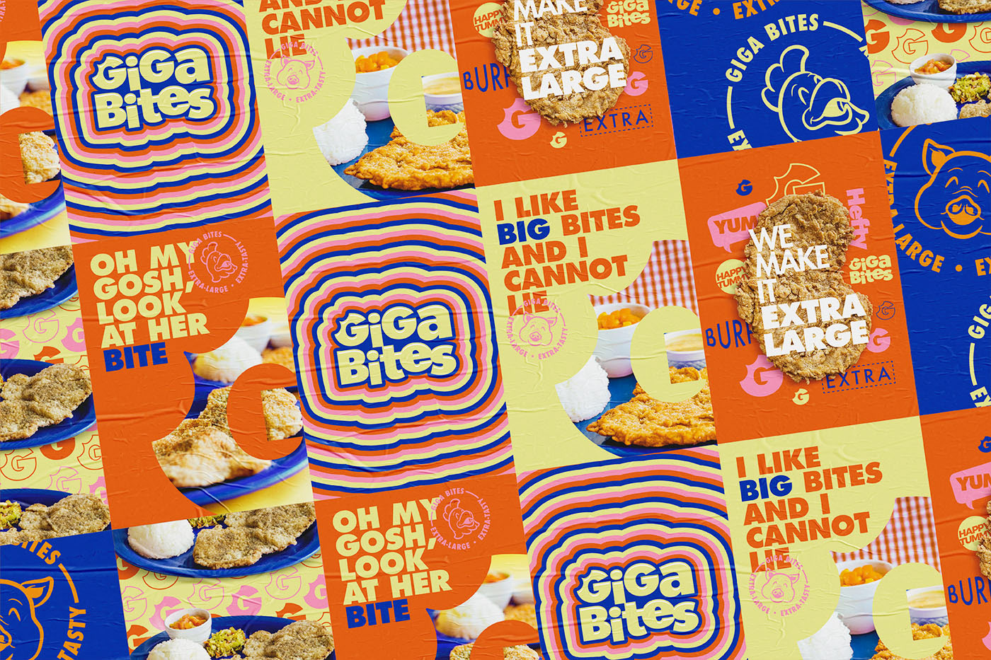
A G with a bite
The brand’s “G” from its logotype is a G bitten by the B from ‘Bites’ to straightforwardly show the selling point of the food cart.
Services: Graphic Design, Branding, Creative Direction
Client: Giga Bites
Photography: J. Ballesteros
Year: 2018